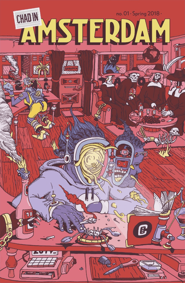
Chad in Amsterdam is a comic book series created, produced, and written by Chad Bilyeu. The illustrations, all in black-and-white, are done by several different artists; their styles ranging from minimalist to detailed and often falling somewhere in between realistic and cartoony. In them, Bilyeu documents his various (mis)adventures as an American immigrant in Amsterdam. The result is a witty, hilarious, and honest series of comic strips that depict situations which Amsterdammers may recognize and others may find intriguing. Given that all of these stories are told from Bilyeu’s perspective, even Dutch readers are likely to look at typically Dutch situations from another angle. In this review I’ll cover both issue #1 and #2, so sit back, relax, and let’s have ourselves a look, shall we?
Chad in Amsterdam #1
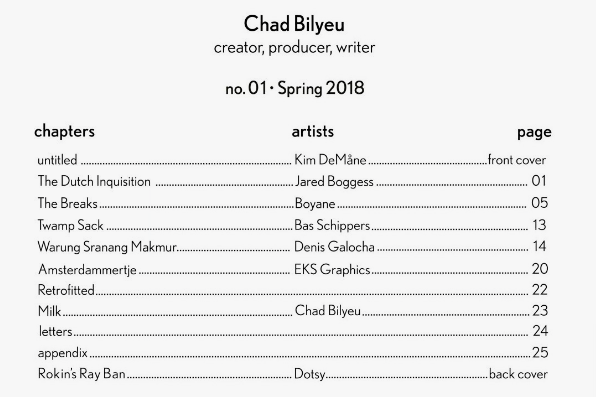
The first issue contains four comic strips, one cartoon, and two short prose pieces. The writing style is fairly consistent across the board. The dialogue in the strips “The Dutch Inquisition,” “The Breaks,” “Sranang Makmur” and “Amsterdammertje” is similar in the sense that there’s an ebb and flow—a kind of back and forth between the characters—just like there would be in real conversations. However, at the same time, some of the dialogue is delightfully blunt and over-the-top—see, for example, the prostitute in “The Breaks” shouting at Bilyeu: “You. Come. Fuck. 50 euro.”

What’s more, most of the strips read like sketches rather than full stories. In “The Dutch Inquisition” we find Bilyeu in a brown bar (a bruine kroeg in Dutch), encountering a rude, posh, Dutch drunk that frustrates him to no end, and in “Amsterdammertje” Bilyeu tries to order a drink but ends up having a hilariously pointless argument with the bartender. “The Breaks,” being the longest strip in the book and also my favorite, follows Bilyeu and his buddy Guus through the streets and alleys of the Red Light District; the twists and turns along the way keep the story fresh and unpredictable throughout. “Sranang Makmur,” on the other hand, is perhaps the weakest strip in the book, but that doesn’t mean it’s bad. It’s about Bilyeu ordering some saoto soup at Warung Sranang Makmur, which is a real Indonesian/Surinamese restaurant in Amsterdam. The dialogue touches on Sukarno, who was Indonesia’s first president, but it stays rather superficial and never really goes anywhere. That said, because of my Indonesian roots and love for saoto soup, I still appreciate this story, even though I feel like Bilyeu missed out on some creative opportunities to make the story more interesting—especially when compared to the other, more outrageous stories in this issue.
Furthermore, the two prose pieces are nice additions to the issue. “Retrofitted” gives us some insight into Bilyeu’s reasons for moving to Amsterdam as well as what he had to sacrifice to make the move possible. He eloquently explains why Amsterdam feels like home to him and it’s a nice companion piece to the comic strips because it allows us to get to know Bilyeu better, if only a little bit. Where “Retrofitted” is more of an autobiographical entry, “Milk” is a funny flash fiction story. It’s about two characters called Jan and Willem, who order milk at a bistro, and Willem just can’t stop raving about how much he “fucking love[s] cow milk.” It seems to me that one of Bilyeu’s greatest strengths as a writer is to take small things—such as the milk—and turn them into exaggerated jokes.

As for the artwork, in “The Dutch Inquisition” Jared Boggess uses a style that I would describe as “minimalist,” because only the panels on the first page have backgrounds to establish the setting. The character designs are also somewhat simple, with the Dutch drunk just wearing a white shirt and Bilyeu a black hoodie. Because of this, the emphasis is on the characters’ facial expressions and body language—a good choice, given that this story is all about a conversation in a pub. I especially love how the gutter—which is the white space in between panels—becomes the bar on which the characters put their drinks.
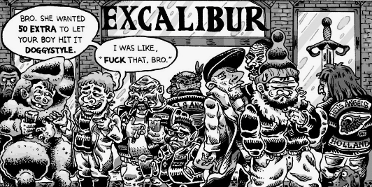
The artwork in “The Breaks,” created by Boyane Zelechowski, is both very expressive and detailed: from the outfits that the many characters are wearing to the litter in the streets and the buildings and canals in the background. Characters’ proportions and facial features are exaggerated in a cartoony way, and along with the many actions and interactions of the background characters, this comic strip really comes to life. In my opinion it’s the most visually striking comic in the issue, and it fits the tone of the story well.

“Twamp Sack” is the one-page cartoon that follows “The Breaks.” The caption reads: “I only have €20” / “You can come in and lick my shoe.” Bas Schippers draws a stylish piece, using somewhat rough inks and creating an interesting composition: we see a confident prostitute with a tall posture and an uninterested look in her eyes in the doorway to her room. She’s contrasted with a short, unshaven, balding man in dirty clothes who wants to go inside with her, but is being rejected because he doesn’t have enough money. It’s a good joke in between stories, albeit not particularly memorable.

Denis Galocha illustrates “Sranang Makmur.” The characters are consistently rendered from various angles, and the inking is clean and tight. I love the page layouts: basically there’s a big panel spread out over every two pages. The first spread shows the restaurant’s exterior. The second its kitchen. The third an image of Sukarno and the mountains of Indonesia. The smaller panels, in which the actual story is told, are placed in rows of four above and below the larger spreads. These smaller and bigger panels play off of each other, which makes for a neat design that helps to keep the pace and tell the story efficiently.
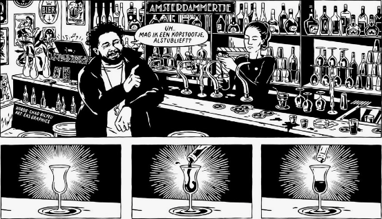
Now, I’m a real sucker for sequential art, which is of course why I’m into comic books. So far the sequences in the aforementioned strips have been great, but the story that steals the show in #1 is “Amsterdammertje,” illustrated by EKS Graphics. Not only do we get to see a detailed pub, with lots of bottles behind the bar and small decorations on the walls, but the sequential art is fantastic. The two pages mirror each other and have the following layout: one wide panel at the top where we see Bilyeu and the bartender; then a row of three panels where we see liquor being poured into glasses; then another wide panel where we see Bilyeu and the bartender again; then two smaller panels next to each other in which we see closeups on Bilyeu’s and the bartender’s eyes, like a Mexican standoff; and finally another wide panel where we see Bilyeu and the bartender again. The way that each panel sets up the next, and is also mirrored by its counterpart on the page beside it, creates a lot of suspense that really drives the story. All in all, this is great work and I’d really love to see Bilyeu work with EKS Graphics on a regular basis.
Chad in Amsterdam #2

The second issue consists of three comic strips, which are slightly longer than the strips in #1, as well as Chad Bilyeu’s character profile, which is aptly titled “Marvel Universe,” and written in a style similar to superhero profiles you may see in comic books published by Marvel and DC Comics. His name, aliases, base of operations, history, etc., are described here in detail, so we get a pretty good overview of who is behind the comic.
In the first story, “Fietsdepot,” we follow Bilyeu on an epic adventure across Amsterdam to get his bike back, which had been towed away. It’s amusing to see Bilyeu confused about the whole situation, but it’s only really when the comic hits the final punchline that the entire story is turned upside-down and a reread is warranted. Without giving away what it is, I can say that the joke is quite clever, but also rather daring because it might be considered offensive by some readers, particularly those that are sensitive to WWII jokes. But then I suppose that that’s exactly what makes the joke work.
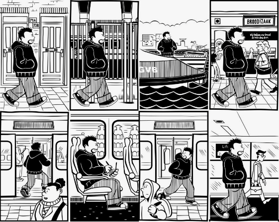
Eryc Why illustrates the story, and there’s a lightheartedness to his art that helps to offset the joke at the end. His inking is very clean and he has a knack for storytelling, as his characters’ expressions and body language match the words that they speak well. Perhaps his page layouts are a little bit too busy with lots of panels crammed in, but he still manages to create smooth sequential passages that are easy to follow.
Moving on to “Spionnetje,” Bilyeu uses a very different narrative style. The story opens with Bilyeu sitting by his window, overhearing British tourists and a prostitute in the street across the canal. The situation that unfolds is chaotic, and the dialogue is reminiscent of the dialogue in “The Breaks” because, once again, we have a prostitute talking dirty: “My pussy. Is throbbing. I need for you to fuck me.” She’s incredibly forward in trying to persuade the tourists to have sex with her, while one of those tourists is constantly arguing on the phone with his girlfriend and the others are married. Whereas the dialogue is blunt and borderline offensive, it’s also hilarious precisely because it’s so extreme.
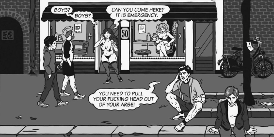
The art is created by EKS Graphics again. The artwork, even though it’s the same static shot in every panel because we’re looking at the same location for the entire story, is actually quite dynamic. Characters are constantly moving through the panels, interacting with each other or ignoring each other. The art illustrates clearly how the characters are feeling, from indifference to frustration. There are also various shades of gray that add a sense of depth and even a sense of color to the comic.
“The Dutch Inquisition Part 2” is a thematic continuation of the story in issue #1. This time we find Bilyeu not in a bar, but walking through the city center with his friend Mike, who has traveled from DC to visit him. Bilyeu explains to Mike what he likes and dislikes about living in Holland, and the emphasis in this story is on his dislikes. It’s a thematic continuation in the sense that Bilyeu talks about how the Dutch tend to treat him as “an American” as opposed to “an individual,” as well as how rude the Dutch can be while calling it “being direct.” To be honest, I’m not even sure if this story really is supposed to be funny, because many of the problems that Bilyeu is addressing are very real problems, and at a certain point the dialogue turns into a rant. But it’s a well-written rant, especially in the final scene, where a barista is “being direct” to Bilyeu and his friend, and Bilyeu answers her like a champ. What I enjoy the most about this comic is the back-and-forth between Bilyeu and Mike; the conversation just flows and there is a lot of chemistry between the characters (as I’m sure there is between them in real life as well).
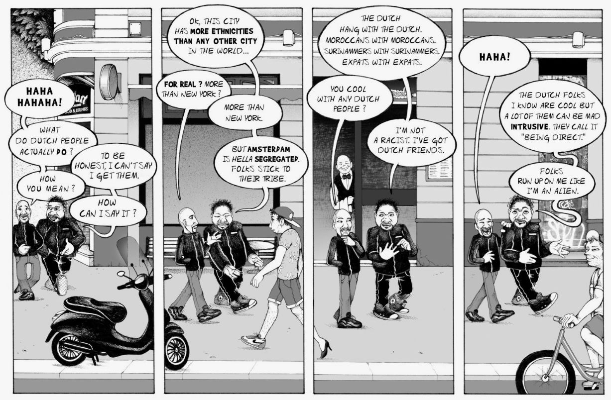
On art duties we have the artist known as DroL. What’s interesting is that you have to rotate the comic 90 degrees to the right, although the reason for this aesthetic choice isn’t entirely clear to me. The artwork itself is beautifully detailed, with people chilling at Dam Square and Bilyeu and his friend moving from panel to panel across the square. They continue to move through various locations, through streets and past canals, and there are always characters moving in the backgrounds, and the world depicted in the story just looks vibrant, even though the comic is in black-and-white. The pencils, the shading, the inking—all of it is subtle and carefully crafted, which adds a kind of softness to the overall look of the strip. DroL’s style is very easy on the eye, and I hope to see this artist in future issues as well.
Conclusion
Chad in Amsterdam #1 and #2 are both a blast to read. If you’re from Amsterdam, you’ll likely recognize some of the locations. If you’re not from Amsterdam, these are still fun adventures to read. Since most of the comic strips read more like sketches than full stories, these are great when you’re looking for some light reading or about ten to fifteen minutes of entertainment. This isn’t about superheroes, zombies, fantasy warriors or deep space travels—but it might just be one of the most honest and real books on stands at the moment. So run to your favorite comic book store, book shop, or simply visit http://www.chadinamsterdam.nl/ for more information. Recommended!


Leave a comment